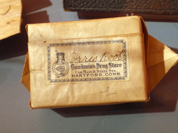
I feel like a kid in a candy store when I walk through the depths of the CHS archives and collections. As someone who loves all aspects of design, I find countless objects, images, colors, drawings, paintings, and trade cards that inspire me in the work that I do. But perhaps what enjoy the most is discovering the different varieties of typography used on our manuscripts, books, posters, and packaging.I was excited to hear we would be doing an exhibit on medical history because so many medicinal packages feature fun and unique typefaces and presentations. So, in CHS’s newest exhibit, This Won’t Hurt a Bit! A History of Pain Relief, there are some really wonderful objects that display either custom hand-designed or intricately quirky typefaces.
Here are some of my favorites:
Absolutely beautiful label with heavy flourishes. The color is almost like an early neon.
An Art Nouveau inspired handwritten type.
An inked block type with small geometric shapes.
A strong grouping of type that work well together.

Orris root package, distributed by Goodwin’s Drug Store, about 1925, Hartford, estate of Florence S. M. Crofut, bequest of Mrs. George H. Day
These quirky details make me happy. The “C” drop cap especially.
This is on the bottom of the same poster. Each letter has it’s own distinction.
I love how the overall shape of the title bends around the drawing.
A faux pas for designers! Don’t use more than three different fonts on a piece. And here so many different typefaces are used but they seem to work well with each other.

Plain absorbent gauze, distributed by the Gladding Drug Co., Hartford, about 1907, estate of Florence S. M. Crofut, bequest of Mrs. George H. Day
An outlined letter form that uses negative space well.
A completely different and newer style than everything else. Simple, geometric.
Mike Messina is the Interpretive Projects Associate at the Connecticut Historical Society.


